If you have been considering re-designing your new website then this post is just for you! I’d want to walk you through everything that went through my mind when creating my new website, in the hopes that it will be useful to you on your own path.
I wanted to break away from the usual “fine-art website style” favoring calligraphic typefaces and softer features. There’s nothing wrong with this, and I do love that specific look, but it does not express the evolution of my own brand.
The evolution of my brand
Before we discuss the website itself, I would like to add context by briefly describing how my brand evolved over the past few years.
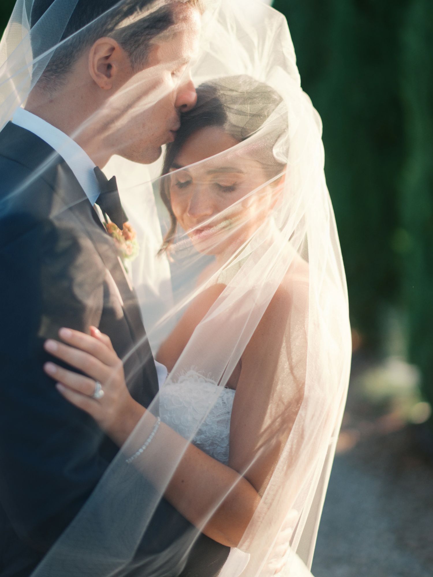
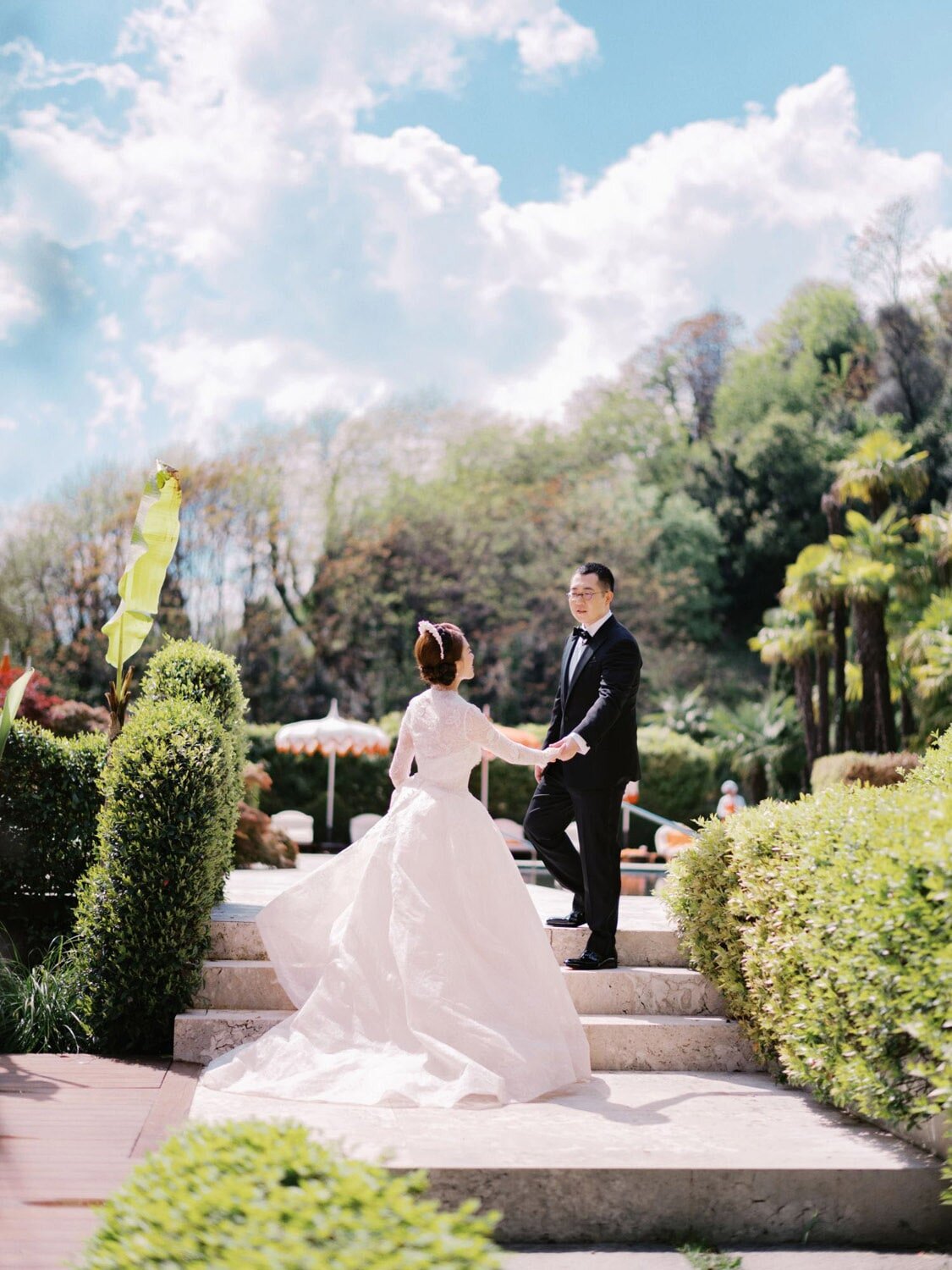
My photography is gradually becoming more and more non-genre-specific. I capture what I enjoy and what triggers my curiosity without much concern about belonging in a specific genre. I care more about consistency in terms of intention. I enjoy just being myself, and I want my photos to reflect that. But I also want to have a meaningful perspective on reality and dare to conceive different possibilities (a kinder world). I can tell you I am so much more free in my photography now that I have given myself permission to photograph subjects just because they pique my interest. I’m intrigued by how life might look like in a photograph, and I’m letting my imagination run wild.
At the same time I am an advocate of finding a sense of purpose in one’s work, a vision. As I like to say when I teach or mentor, given a choice, couples will always choose the photographer who inspires them with their vision and not the most technically skilled one. I wanted my vision to be clear throughout the website.
The logo
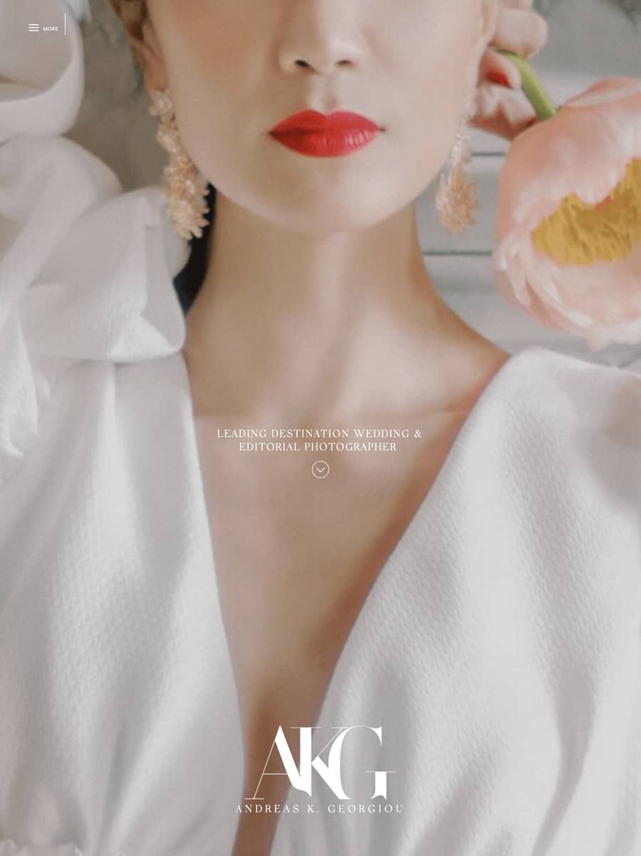
I decided to work with the classic 18th century Didot typeface and redesign a modernized version of it. The logo had to reflect the two worlds that inspire me: heritage and fashion. The resulting logo is crisp, with modern, bold lines, while maintaining the charm of the familiarly classic Didot font. (pro tip: don’t spend too much time on your logo: a logo is similar to how you dress your hair. It should be lovely, but what’s within your head is much more important).

“Flat 2.0”
The logo on the mobile is placed in a transparent canvas and floats over the content. I chose to avoid the typical solid menu bar found on most mobile interfaces. I wanted the overall aesthetic to be as flat as possible. Layering is achieved through the scrolling motion of juxtaposed elements. The only skeuomorphic graphical user interface (skeuomorphic interfaces emulate the aesthetics of physical objects) is the use of some iPad and iPhone mockups here and there. As a general idea, I desired an experience that is “authentically digital”, one that embraces the digital medium for what it is (some call this design principle “flat 2.0”).
Editorial feel
The website feels like an editorial/ fashion publication thanks to the liberal use of visual juxtapositions and large titles. My hope is that this editorial feel will give the viewer the rewarding feeling of flicking through a fashion magazine.
The content
This website represents a shift in emphasis from “what can I gain?” to “what can I offer?”. I want to be of service and to infuse meaning into whatever I do; to share things that I enjoy, but more importantly, things that others enjoy; to establish a more personal connection with others. I wanted my website to bring my offline and online relationships and activities together. Perhaps the most meaningful comment I received was from a wonderful colleague photographer who said, “The website feels precisely like you.”
Over the years, I’ve found myself producing a large amount of content that I’ve never had the right home for: travel guides, images of people I’ve met, studio work that is distinctly different from my main body of work, events with partial NDAs and where the images allowed for publication couldn’t fill an entire gallery set, and a lot of personal and experimental work. In addition, I frequently write on marketing and culture, plus I’ve always wanted my own podcast.
One of the main motivations behind the website’s design was to create the foundations of an ecosystem where all of this content could be finally homed. My brand has evolved to serve a far broader audience than only couples getting married. I create content for photographers, creatives, marketers, and globetrotters alike. I’m hoping that this concept will mature even further and that I’ll be able to work with guest content creators as well.
The small decisions
They say that craftmanship is found in the smallest of details (observe the stitching on any designer’s clothing for a second). Several little, yet important, decisions were made along the way. I consider these a matter of generosity to my user (a word you will hear me use often, because I deeply and genuinely believe in it):
- Easy ways to navigate back to all the galleries
- Several connection points with relevant content
- Bookmarks allowing users to quickly scroll through longer pages
- “Get to top” bookmarks (which are so often forgotten)

The “About me” page
Allowing people to meet us is important, because we all want to connect. Sometimes I browse “about” pages and discover there is too little meaningful information about the people behind the brand; nothing except some generically written, buzzword-rich text. I find myself yearning to interact with people in my field, but do not have any information about them that will allow me to send them a personal email.
This is why I wanted to find ways that would allow my visitors to get to know me more meaningfully. A timeline was added in the “About” page, as well as plenty of behind-the-scenes videos. When I was designing the “about” page, I truly wanted folks to feel as though they know me well enough to write me personal emails (not just inquiries)! I’d be thrilled to get a message of the sort “hey, I thought this was fascinating” or “I adore that image of your dog, I’m a dog lover as well”! This is what my “about” page is for. It’s not a place for me to gloat; rather, it’s a place for me to generously share in the hopes that someone may want to connect with me. This sort of intimate connection is something I yearn for. This, I believe, has been forgotten in our efforts to exhibit an exaggerated, “elevated” version of ourselves. We’re not big businesses; we’re personal brands! Let’s embrace it and have fun with it.

Connection
I frequently use the phrase “connection.” This concept is as important to me as “generosity”. Connection lays the foundation for a relationship and grants permission to speak with people who will listen. Connection is all about meaningful, emotional relationships. I sincerely hope that more and more industry websites will include “about me” sections that are more humanized therefore allowing visitors to connect on a more personal level.
ShowIt is digital artisanship!
It’s worth noting that ShowIt’s outstanding infrastructure is the sole reason I was technically able to bring all of the above to life. Their ability to engineer an elegant development environment is nothing short of digital artisanship. I’m fascinated by how ShowIt made it possible to create interactive experiences using just a few, well-thought-out tools (canvas stacking, scroll actions, click actions, and views). As someone who has previously worked in high-tech where I was surrounded by whole teams of developers who could fulfil every digital wish imaginable, I sincerely never felt limited when self-developing in ShowIt!


